Subsections
Scenario Performance Data and Histograms
SimPy probes monitor and collect performance metrics experienced by
individual entities in the simulation. By plotting several of these
metrics as histograms, we can gain some deeper insight into what the
system is doing over time.
We present a set of example histograms in Figures
5.8 through
5.12. This data was taken from one of
the 1D rail networks with linear sequential routing serving a moderate
load of passengers.
Passenger Performance Metrics
Improving system performance perceived by passengers of the system often
comes at the expense of vehicle fleet operating costs. Improving
passenger service goals typically increases the number of vehicles
operating and the distance they must travel during the course of a
schedule. Since our optimization goal favors the fulfillment of
passenger goals first, we expect to see some fairly straightforward
trends.
Histograms in red pertain to the transit system performance from the
point of view of the passengers.
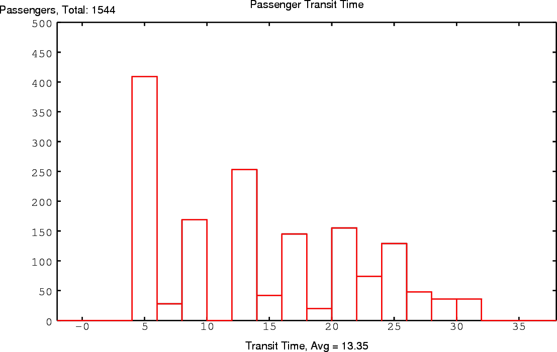
- Transit Time: In Figure 5.8, we
see the total number of passengers served by the system, and
time they were delivered to their final station. Thus, we
can view this graph as the system response to the demand
impulse at time
 . Each time segment takes 2 units of
time. Therefore the width of each histogram bin is 2 time
units long, and we don't see our first arrivals until
. Each time segment takes 2 units of
time. Therefore the width of each histogram bin is 2 time
units long, and we don't see our first arrivals until  ,
since passengers must travel through 2 segments via a
waypoint before arriving. Large groups of passengers
continue to get dropped off at their destinations after
roughly every other time segment, since all stations are
separated by one waypoint. The quantity of passengers
delivered diminishes with time, as fewer combinations of
station pairs are that number of segments apart. We do
notice that some deliveries are also made on the ``odd''
time steps in between the ``even'' peaks, where the
scheduler has shuffled some of the overflow passengers to
take advantage of unused station capacity.
,
since passengers must travel through 2 segments via a
waypoint before arriving. Large groups of passengers
continue to get dropped off at their destinations after
roughly every other time segment, since all stations are
separated by one waypoint. The quantity of passengers
delivered diminishes with time, as fewer combinations of
station pairs are that number of segments apart. We do
notice that some deliveries are also made on the ``odd''
time steps in between the ``even'' peaks, where the
scheduler has shuffled some of the overflow passengers to
take advantage of unused station capacity.
Figure 5.8:
Passenger Transit Time
 |
- Departure Latency: Figure 5.9
shows us the amount of time most passengers spend waiting at
their station of departure. Most passengers can board
vehicles right away, whereas a small number of passengers
must wait for the next time step. This helps shed light on
the ``even'' peaks and ``odd'' valleys we saw in the
passenger transit time histogram of Figure
5.8.
Figure 5.9:
Passenger Departure Time
Figure 5.10:
Passenger Stops / Transfers
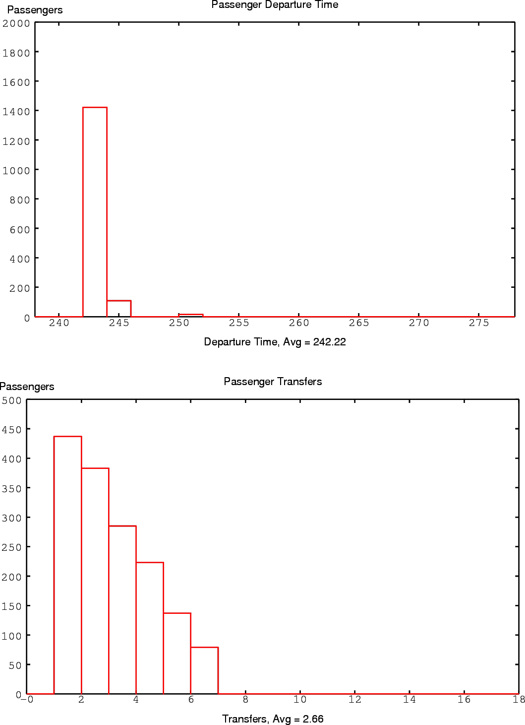 |
- Number of Stops / Transfers:
Finally, Figure 5.10
shows us how many stops passengers had to endure to
get to their destinations.
Since we only had 7 stations in our linear network that
passengers must visit in sequence, we get a very predictable
ramp down to 6 stops for passengers that traversed the
entire line from one end to the other.
Vehicle Fleet Performance Metrics
Histograms in blue relate to vehicle fleet activity.
- Segments Traveled:
Figure 5.11
shows the system response of vehicles to the demand impulse.
Again, we see a gradual ramp down, as fewer passengers
remain in the system as time passes. In our scenarios, the
second bin tends to have the most traffic. The first bin
likely is lower because the initial location of the vehicles
is free, so vehicles can essentially be created anywhere.
Therefore, the difference in the first bin and the second
bin might be attributed to the advantage vehicles receive
from the ability to magically appear exactly where they are
needed for these scenarios.
A more difficult feature to explain is the valley right
after the first peak of activity (and to some extent the
less pronounced valleys following subsequent peaks). The
system appears to operate in fits and starts, and it
actually appears to rest between surges of activity. This
is observed in all of the linear sequential routing
scenarios. The optimization function attempts to deliver
passengers as early as possible, so we would expect the
system to push deliveries to the left and not waste time
``resting''. Perhaps the system is maxing out its capacity
in a highly coordinated fashion during a delivery peak, and
then uses the ebb of the rest period to do some
``housekeeping'', moving a small number of vehicles out of
the way for the next coordinated surge. In this fashion,
the system could deliver large numbers of people faster in
two pulses with a gap between them as opposed to spreading
the deliveries out evenly, especially if these coordinated
pulses were necessary to allow passengers to make transfers.
Figure 5.11:
Vehicles In Transit
Figure 5.12:
Vehicle Fleet Utilization
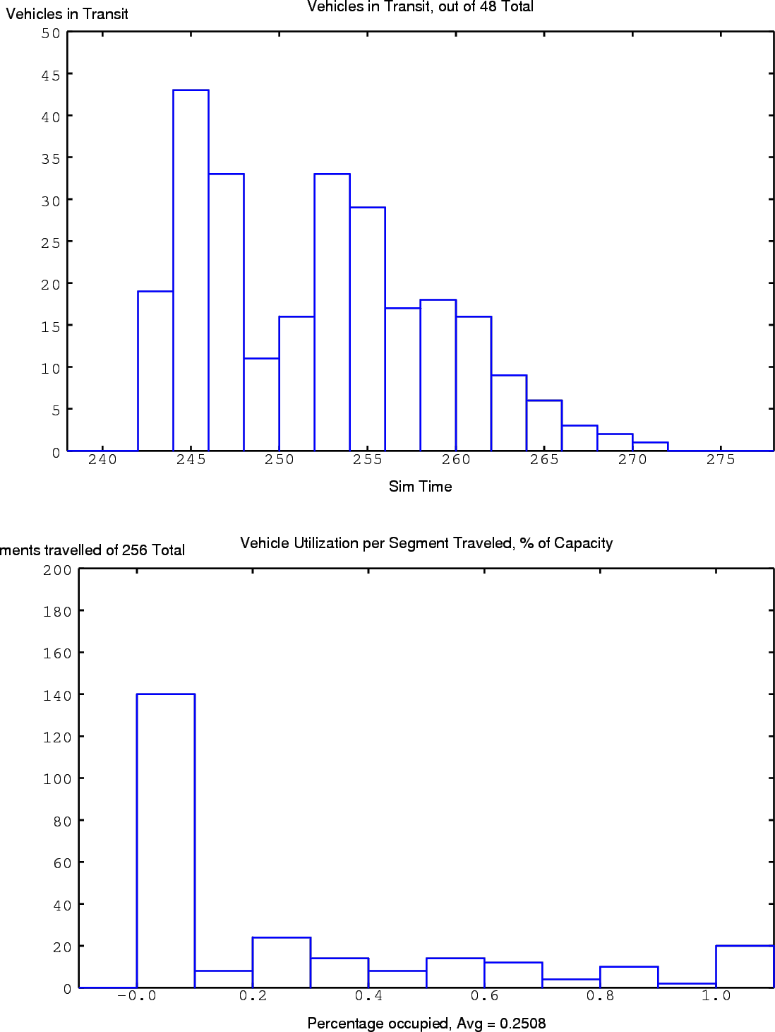 |
- Utilization per Time Step:
Finally, we look at how full the
vehicles were as they traveled their routes in Figure
5.12. Since minimizing
vehicle travel is the lowest priority goal, the vast
majority of vehicles operate nearly empty. In this
scenario, the empty vehicles are likely moving out of their
way of the ones with passengers. Also, some empty vehicles
may move to restore the fleet's initial state at the end of
the scenario, which offsets some of the advantage gained by
their ``magical'' initial positioning discussed in Section
5.4.3.
Gains in vehicle utilization and thus efficiency could be
achieved by cutting back on the number of vehicles in the
fleet and performing a new optimization. This would allow
us to still emphasize passenger performance over vehicle
efficiency. Otherwise, the scheduler would likely present
passengers with unreasonable wait times and transfers in
order to fill its vehicles up to capacity.
Rowin Andruscavage
2007-05-22